top of page

Custom Painted Denim Jacket inspired by Rush
2019
Bleached and custom painted denim jacket inspired by Rush's first album cover. Used a combination of ink markers, paint markers, and fabric paint. Focused on capturing the original spirit and design language of the logo while adapting it to my moniker.
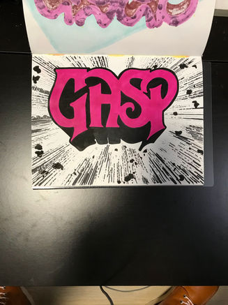
I drew this art piece in my sketchbook inspired by Rush's 1974 self-titled debut album. I love the simple idea of their now-famous logo bursting forth with comic book inspired motion lines and debris. It says "we are here!" without using a single word (other than the logo, of course). GASP was an art name I was using at the time, a nod to my initials being GAS.
The main artistic challenge was imagining how the letters G, A, and P would look in this font, as I had only four existing letters to go off of. I really wanted to preserve as much of the original spirit as I could, but still make sure it was legible. P was the most obvious letter, as I only needed to remove the right leg from the capital R to make a capital P. A came to me next. The U in the original logo already had a somewhat angular look, so I tried flipping it upside down. I think it was already pretty close, so I added the cross line, and ended up with a very clear capital A.
The G was the most challenging letter and I spent by far the most time coming up with its design. I tried to incorporate elements of the P, H, and S to make it cohesive. I began by rotating the P 180 degrees to copy the curve for the bottom of the G and the way it intersects with the vertical line. I then mirrored that vertically to create the round top and made some small tweaks to both curves until I had the main body shape. The vertical line section of the G is mimicking the style seen in the P, H, and R, but shortened. It most closely takes the shallower angle of the R on the serifs. I felt leaving the round top of the G left the logo feeling a bit slanted to the right, where the original logo had a more balanced left-right appearance. To add some volume to the top left of the logo, I mimicked the flat top section of the S, applying that theme symmetrically to the G. I think this both gives more left-right balance to the logo and adds more repetition of shapes, making it more cohesive.
After getting the letter shapes figured out, I drew in the 3-D outline. I moved on to the background. Using a ruler to get consistent lines , I chose a vanishing point and began filling out the page. I added some rubble as I saw fit, and then did the fill color before finishing with the outline. I was very happy with the outcome, and it stayed in the back of my mind for a few weeks.
On my usual rounds at my local thrift stores, I found a light stonewashed denim jacket. Having made a few custom jackets before, I felt this would be a good canvas for my recent art piece. Wanting to match the original background color, I needed the jacket to be as close to white as I could get it. Nothing a little bleach couldn't fix. I soaked it a total of 3 times in a 5 gallon bucket with diluted bleach to get the shade I was looking for. After it was rinsed and thoroughly dried, I got to work on painting.
I transferred the outlines to the jacket and started with the background. since these were small lines, I felt comfortable using my molotow acrylic paint pens for this without the design crumbling away over time. I didn't want to use the same markers I used for the sketchbook to do the pink letter fill, as they are prone to fading in the sun, so I ended up getting some pink fabric paint. to help the logo pop against the off-white jacket, I added a bright white glow around the outside, and finished with the outline with a black marker, which helped me get a consistent, bold, and smooth line.
Overall, I'm very proud of the results! I think the white glow was a nice addition. I am happy I could make a tribute to one of my favorite bands while putting my own twist on it. It was a good exercise in trying fit in with existing branding while still being creative. I am looking forward to painting some more jackets again.


bottom of page


